Pseudo-classes are a useful way to add styling to your Bricks site. But this doesn’t work well when you are doing card animations with a clickable element. The element might become unclickable when applying pseudo-classes like :hover to animate the entire container within the card.
In this tutorial, I’ll show you how to manually create a custom card with animation that maintains the clickability of elements. What we are going to do is essentially wrap the whole element so that the whole element becomes clickable.
Understanding the Problem with Pseudo-Classes
Using pseudo-classes like :hover to animate card elements can create issues with clickability. When the entire card container is animated, child elements such as images or text links may not remain functional for clicks. Our approach avoids this by using custom CSS classes and a structured method.
Step-by-Step Guide to Creating Clickable Animated Cards in Bricks Builder
Step 1: Setting Up the Card Structure
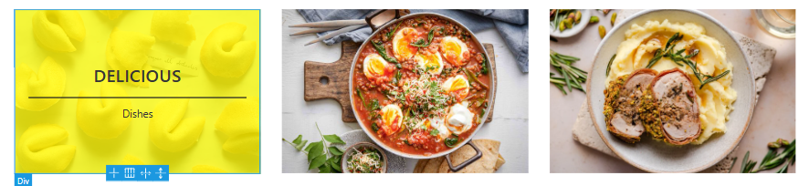
First, use an existing page or add a new one.
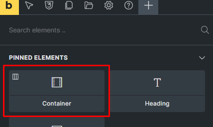
Start by adding a container.
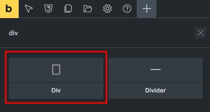
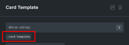
Inside the container, add a div element. Name this div element “Card Template” for easy identification.

Adding Elements
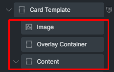
Inside the “Card Template,” add the following elements:
- Image Element: For visual content.
- Two Div Elements:
- Name one “Overlay.”
- Name the other “Content.”
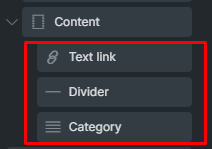
Inside the “Content” div, add:
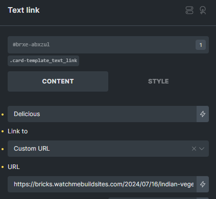
- Text Link Element: For clickable actions.
- Divider: For separating content.
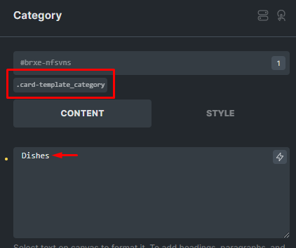
- Basic Text: Label this as “Category.”
Step 2: Applying CSS Classes and Layout
Assigning CSS Classes
Create CSS classes for each of the elements added:
- Card Template
- Overlay
- Content
- Image
- Category
- Divider
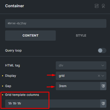
Configuring the Container
Set the container’s display to “grid”. Specify the number of ‘grid-template-columns’ you want.
Styling the Overlay
Adjust the background color and transparency.
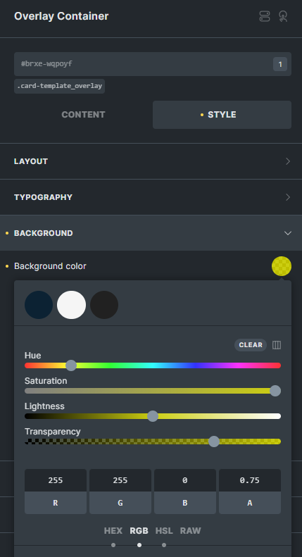
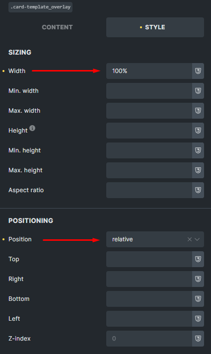
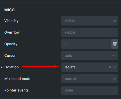
Set the width and position to “relative”. For isolation, select “isolate”.
Styling the Card Template
- Similar to the overlay, adjust position (relative) and isolation (isolate) properties.
- Go back to the Overlay Container and change the overlay’s position to “absolute”.
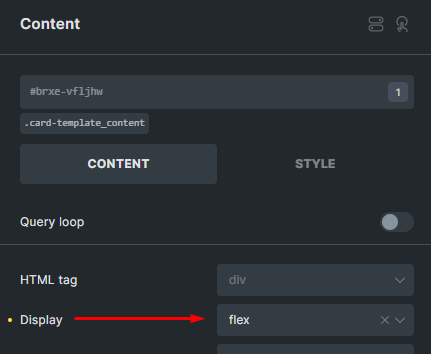
Aligning the Content Section
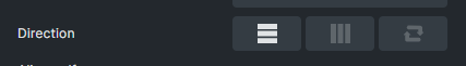
Set display to “flex”.
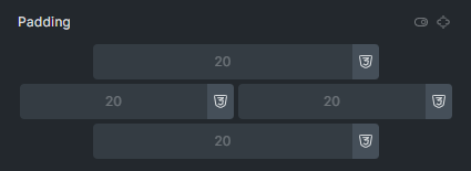
Adjust direction and alignment. Set padding and row gap.
Step 3: Customizing Elements
Customizing the “Category” Element
Modify the text and assign a CSS class.
Customizing the Text Link
Change the text as needed and assign a CSS class.
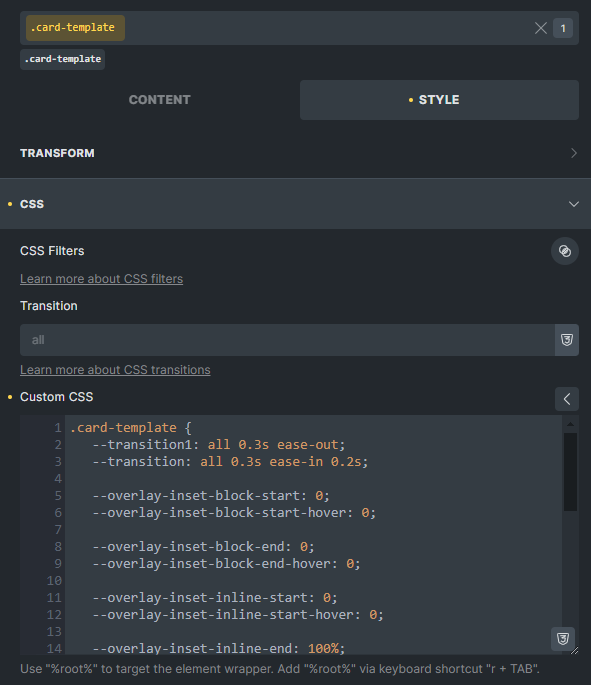
Implementing Custom CSS
Apply custom CSS to ensure hover effects work seamlessly:
- Make text and divider elements hidden by default.
- On hover, use opacity and transform transitions to make them appear.
CSS Code
/* Parent container for the card */
.card-template {
    position: relative;
    overflow: hidden; /* Ensures the overlay stays within the bounds of the parent */
}

/* Default state of the overlay (hidden) */
.card-template .card-template_overlay {
    position: absolute;
    top: 0;
    left: 0;
    right: 0;
    bottom: 0;
    background-color: yellow;
    opacity: 0;
    pointer-events: none; /* Prevents overlay from blocking interaction */
    transition: opacity 0.3s ease-out;
    z-index: 1; /* Overlay appears below the text initially */
}
/* Show overlay on hover */
.card-template:hover .card-template_overlay {
    opacity: 1;
    pointer-events: auto; /* Allows interactions with the overlay when visible */
}

/* Initially hide text link */
.card-template .card-template_text_link {
    position: relative;
    z-index: 2; /* Ensures text stays above the overlay */
    opacity: 0; /* Hide text by default */
    transform: translateY(30px); /* Slightly move text down */
    transition: opacity 0.3s ease-out, transform 0.3s ease-out;
}

/* Show text link on hover */
.card-template:hover .card-template_text_link {
    opacity: 1; /* Make text visible */
    transform: translateY(0); /* Reset the transform */
}
/* Initially hide divider */
.card-template .card-template_divider {
    position: relative;
    z-index: 2; /* Divider will be above the yellow overlay */
    opacity: 0; /* Hide divider by default */
    transform: translateY(30px); /* Move it slightly */
    transition: opacity 0.3s ease-out, transform 0.3s ease-out;
}

/* Show divider on hover */
.card-template:hover .card-template_divider {
    opacity: 1; /* Make divider visible */
    transform: translateY(0); /* Reset the transform */
}

/* Initially hide category */
.card-template .card-template_category {
    position: relative;
    z-index: 2; /* Category will be above the yellow overlay */
    opacity: 0; /* Hide category by default */
    transform: translateY(30px); /* Move it slightly */
    transition: opacity 0.3s ease-out, transform 0.3s ease-out;
}

/* Show category on hover */
.card-template:hover .card-template_category {
    opacity: 1; /* Make category visible */
    transform: translateY(0); /* Reset the transform */
}
Alternative CSS Code (Summary):
%root% {
   --transition1: all 0.3s ease-out;
   --transition: all 0.3s ease-in 0.2s;

   --overlay-inset-block-start: 0;
   --overlay-inset-block-start-hover: 0;

   --overlay-inset-block-end: 0;
   --overlay-inset-block-end-hover: 0;

   --overlay-inset-inline-start: 0;
   --overlay-inset-inline-start-hover: 0;

   --overlay-inset-inline-end: 100%;
   --overlay-inset-inline-end-hover: 0;
}

%root%_overlay {
    transition: var(--transition1);
    inset: var(--overlay-inset-block-start) var(--overlay-inset-inline-end) var(--overlay-inset-block-end) var(--overlay-inset-inline-start);
  min-width: unset;
  min-height: unset;
}

%root%:is(:hover, .focus-within) {
    --overlay-inset-block-start: var(--overlay-inset-block-start-hover);
    --overlay-inset-block-end: var(--overlay-inset-block-end-hover);
    --overlay-inset-inline-start: var(--overlay-inset-inline-start-hover);
    --overlay-inset-inline-end: var(--overlay-inset-inline-end-hover);
}
Step 4: Testing and Refinement
Hover Effects
Ensure that text and overlay containers fade in and slide up on hover.
Clickability
Verify that the text is clickable and functional.
Conclusion
This method provides a simple yet effective way to build custom animated cards in Bricks Builder while maintaining full card clickability. By avoiding pseudo-classes like :hover and using structured CSS classes, you ensure your design is both functional and visually appealing.