Introduction
In today’s digital landscape, your website’s first impression matters more than ever. A hero section is the visual and emotional entry point of your site it’s what grabs attention and communicates your brand instantly.
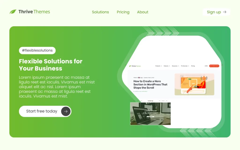
Using Thrive Themes, creating a professional, high-performing hero section is easier than you might think. Thrive’s drag-and-drop builder lets you combine design freedom with conversion-focused elements, no coding required.
In this tutorial, we’ll walk through how to build a Tesla-inspired hero section using Thrive Architect, discuss why hero sections are so important, cover best practices for design and functionality, and troubleshoot common layout issues.
Understanding the Hero Section
What is a Hero Section?
A hero section is the large banner area at the top of your website’s homepage or landing page. It usually contains:
- A background image or video
- A headline and subheadline
- A call-to-action button
This section immediately tells visitors who you are, what you offer, and why they should care.
Why Tesla’s Design Stands Out
Tesla’s hero section is a perfect example of minimalism done right.
It uses:
- Clean imagery focused on the product.
- Concise, bold text that communicates value clearly.
- A strong call-to-action that guides users immediately.
We’ll take inspiration from this structure when building our hero section in Thrive Themes.
Importance of a Well-Designed Hero Section
A great hero section does more than look good it drives results.
Here’s why it’s vital:
- First Impressions: Users decide within seconds whether to stay or leave.
- Brand Identity: It defines your visual tone and communicates your brand instantly.
- User Engagement: A clear CTA encourages visitors to take action right away.
- Conversion Optimization: Good hero sections improve sign-ups, purchases, or inquiries.
In short, your hero section should be simple, visually striking, and purpose-driven.
Step-by-Step Guide to Creating a Tesla-Inspired Hero Section in Thrive Themes
Step 1: Create or Edit a Page
- Go to your WordPress Dashboard → Pages.
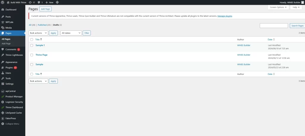
- Click Add New or edit an existing page.
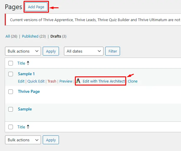
- Choose Edit with Thrive Architect to launch the page builder.
Step 2: Build or Edit Your Header
- Hover over the existing header and click Edit Header.
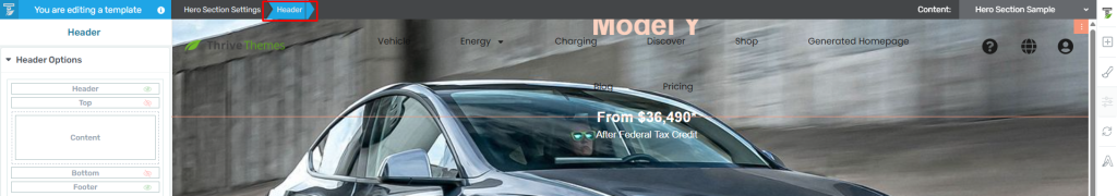
- You can use a pre-designed template or create one from scratch.
- Arrange your logo, navigation menu, and icons neatly.
- For a minimal look, remove unnecessary items and use a transparent or dark header to match your hero image.
Step 3: Add a Hero Section Container
- Click Add a New Section → choose Full Width Layout.
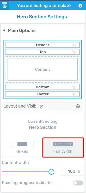
- Under Background Style, upload a high-resolution image (e.g., a product photo or background landscape).
- Adjust the overlay or gradient so the text will remain visible and readable.
Step 4: Overlay the Header (Optional)
To recreate Tesla’s overlay effect:
- Edit your header again and remove the solid background color.
- Under Layout & Position → Advanced, set Position: Absolute.
- Increase Z-Index so the header sits above the image.
- Click Update to save.
Step 5: Add Your Headline and Subheadline
- Drag a Heading element into the hero section.
Example: “Electric Performance. Redefined.” - Add a subheading below for context.
- Customize fonts, colors, and spacing in the Typography settings.
Keep it clean, Tesla’s design philosophy focuses on clarity and impact.
Step 6: Add a Call-to-Action (CTA) Button
- Drag the Button element under your text.
- Change the label to something action-oriented, e.g., “Order Now” or “Learn More.”
- Use a bold color for contrast against your background.
- Align it center for balance and apply hover effects if desired.
Step 7: Adjust Layout and Responsiveness
- Fine-tune margins and padding for proper spacing.
- Preview in desktop, tablet, and mobile view to ensure everything aligns perfectly.
- Thrive Themes allows easy mobile adjustments tweak font sizes and button placement if needed.
Step 8: Save and Preview
- Click Save Work, then Save and Preview.
- Review your hero section visually and make any small tweaks for spacing, alignment, or readability.
Best Practices for Design and Functionality
✅ Keep It Minimal: One message, one image, one call-to-action.
✅ High-Quality Visuals: Avoid stocky or cluttered images; use professional visuals.
✅ Readable Contrast: Make sure text is visible against your background.
✅ Optimize for Speed: Compress images to maintain fast loading times.
✅ Mobile-First Design: Always test on phones and tablets most users browse on mobile.
Remember: less is more. Simplicity conveys confidence.
Troubleshooting Common Issues
- Header Overlapping Incorrectly
- Check your Z-Index values and Position settings (Absolute vs. Relative).
- Make sure the hero section doesn’t have extra top padding.
- Text Not Readable
- Add a semi-transparent overlay or darker gradient.
- Adjust the font color or add a subtle text shadow.
- Image Cropped or Distorted
- Set Background Size: Cover and Position: Center in Thrive’s background settings.
- Button Misaligned
- Use the Flexbox alignment options or adjust column padding.
- Mobile Layout Broken
- In responsive view, modify font sizes, line heights, and button width for small screens.
Conclusion
Mastering the hero section in Thrive Themes helps you create pages that are both visually stunning and high-converting.
By taking cues from Tesla’s clean, focused design, you can make a strong first impression while guiding visitors exactly where you want them to go.
Keep refining your layout, test how users interact with it, and remember clarity beats complexity every time.
If you found this tutorial helpful, don’t forget to like, subscribe, and comment below what you’d like to learn next maybe parallax effects, dynamic content, or a mega menu tutorial!
Check out our video tutorial for an easy way to learn!